| View previous topic :: View next topic |
| Author |
Message |
Sharpies!
Master Cheater
 Reputation: 0 Reputation: 0
Joined: 13 Dec 2006
Posts: 433
Location: Somewhere, Anywhere, The World.
|
 Posted: Sat Dec 26, 2009 4:44 pm Post subject: Some new stuff. Posted: Sat Dec 26, 2009 4:44 pm Post subject: Some new stuff. |
 |
|
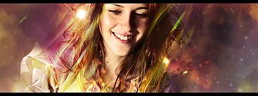
Had some extra time over the Christmas holidays.
Haven't done this for awhile so I'm a tad out of practice (not that I was very good to start ;-; )

done for a friend
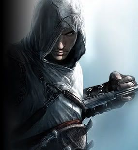
attempted abstract piece

_________________
|
|
| Back to top |
|
 |
Moments
Grandmaster Cheater Supreme
![]() Reputation: 17 Reputation: 17
Joined: 20 Mar 2008
Posts: 1196
|
| Posted: Sat Dec 26, 2009 5:05 pm Post subject: |
|
|
ohmygodthatssexy.
I love your 'glow' in the images.
May I request ;3?
|
|
| Back to top |
|
|
zackary
Master Cheater
 Reputation: 1 Reputation: 1
Joined: 18 Aug 2008
Posts: 440
Location: zombie town
|
| Posted: Sat Dec 26, 2009 5:20 pm Post subject: |
|
|
why does the first one have the title of "FAIL"?
_________________
|
|
| Back to top |
|
|
Sharpies!
Master Cheater
Reputation: 0
Joined: 13 Dec 2006
Posts: 433
Location: Somewhere, Anywhere, The World.
|
| Posted: Sat Dec 26, 2009 5:30 pm Post subject: |
|
|
I try to organise my pictures, but usually, that doesn't happen.
Hence, my photoshop folder contains "fail", "lolew", "derp", "hello", etc. >_>;
Photobucket > my computer when it comes to finding my work. D:
| Sorrow wrote: | ohmygodthatssexy.
I love your 'glow' in the images.
May I request ;3? |
Yeah, I guess. I usually don't do that though because I have times where I'll make a ton of things in a day, and then other times where the times I work are far and in between. xD
_________________
|
|
| Back to top |
|
|
Fantasy
I post too much
![]() Reputation: 13 Reputation: 13
Joined: 29 Jul 2007
Posts: 3113
|
| Posted: Sat Dec 26, 2009 7:14 pm Post subject: |
|
|
| I like your style, but the abstract one .. Na-ah. Very messy and it looks quite weird, but way2go on the creativity :b
|
|
| Back to top |
|
|
Simon :v
Grandmaster Cheater
 Reputation: 38 Reputation: 38
Joined: 11 Oct 2006
Posts: 708
|
| Posted: Sun Dec 27, 2009 12:38 am Post subject: |
|
|
I like the first one.
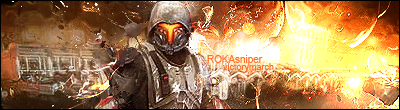
The second one's text seems off, IMO.
The third one is too... contrasting.
Not sure how to explain it, but it feels like some shapes are uber-smooth, whilst some others are incredibly sharp.
|
|
| Back to top |
|
|
Clairenix
Grandmaster Cheater
 Reputation: 5 Reputation: 5
Joined: 19 Dec 2007
Posts: 715
|
| Posted: Sun Dec 27, 2009 12:44 am Post subject: |
|
|
The first is amazing~!
Second is kind of over-sharpened
Third is meh, I can't explain. D:
_________________
|
|
| Back to top |
|
|
Daniel.
I post too much
![]() Reputation: 72 Reputation: 72
Joined: 08 Nov 2007
Posts: 2938
|
| Posted: Sun Dec 27, 2009 5:58 pm Post subject: |
|
|
first is pretty cool
second text is meh
third too clustery
_________________
|
|
| Back to top |
|
|
Oblivious
Grandmaster Cheater Supreme
![]() Reputation: 45 Reputation: 45
Joined: 12 Mar 2008
Posts: 1732
|
| Posted: Mon Dec 28, 2009 3:12 pm Post subject: |
|
|
Bads:
1. A little too bright, and you overuse the glow effect. >:(
2. Try applying a reduce noise/topaz filter on it, it looks a little sharp.
3. Text dun need dat outer glow. Also, default fonts are a little bleh.
Goods:
1. Compo looks good.
2. Colors look fairly good, might wanna apply some grad maps or mess with the levels if you get the chance.
3. I rather like the clouds/nebula in the bg.
Bads:
1. It looks seriously LQ. Reduce noise or just scratch the whole thing tbh. Also, seriously too much contrast, tone it down a bit.
2. Shitty default font with solid color. :<
3. Render doesn't have a lot of flow, but that can't be helped.
Goods:
1. I like the use of clipping masks, adds a lot of flow to the foreground and the background.
2. Compo is pretty good. Kiu.
3. I don't know why, but I like the explosion in the background. :>
No comment. :<
All in all, your compo is fairly strong, but you need to work on your colors and text.
|
|
| Back to top |
|
|
|