| View previous topic :: View next topic |
| Author |
Message |
I am Deadmaster
Newbie cheater
![]() Reputation: 0 Reputation: 0
Joined: 29 Jan 2010
Posts: 24
|
 Posted: Fri Feb 05, 2010 10:33 pm Post subject: Hot off the press Posted: Fri Feb 05, 2010 10:33 pm Post subject: Hot off the press |
 |
|
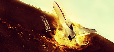
Yea the lighting needs work but it was a 45 minute sig battle thing, 45 minutes freestyle,=o
And here it is (in the attachements)
Took a lot more work than you think, I made the fire, I made the hole, most of the dirt was Cloned, and colored a bit to make it seem different the sky, etc, etc,
Anyways enjoy =)
And cnc anything besides the lighting coming from a mysterious source.
| Description: |
|
| Filesize: |
156.69 KB |
| Viewed: |
23705 Time(s) |
|
|
|
| Back to top |
|
 |
Rick.
Grandmaster Cheater
 Reputation: 6 Reputation: 6
Joined: 02 Jul 2008
Posts: 657
Location: In the netherlands
|
| Posted: Sat Feb 06, 2010 6:09 am Post subject: |
|
|
| Seems a bit too bright in the upper right hand corner, and the text would be better the other way around, so we don't have to flip our heads upside down to actually read what it says. The fire does look nice on it.
|
|
| Back to top |
|
|
To0k
How do I cheat?
![]() Reputation: 14 Reputation: 14
Joined: 16 Nov 2007
Posts: 0
|
| Posted: Sat Feb 06, 2010 6:36 am Post subject: |
|
|
I think it's awesome.
8/10
|
|
| Back to top |
|
|
Trucido
Moderator
![]() Reputation: 6 Reputation: 6
Joined: 08 Sep 2007
Posts: 2792
|
| Posted: Sat Feb 06, 2010 6:44 am Post subject: |
|
|
It looks cool, but to be honest I cant tell whats going on with the plane.
And the 321 looks choppy.
But its very well made.
_________________
I'm out. |
|
| Back to top |
|
|
I am Deadmaster
Newbie cheater
![]() Reputation: 0 Reputation: 0
Joined: 29 Jan 2010
Posts: 24
|
| Posted: Sat Feb 06, 2010 10:47 am Post subject: |
|
|
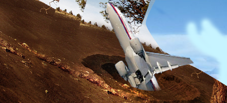
Yea the aiplane fucks with the brain, Lol
But heres what the airplane looks like:(Attachement, still can't post Urls)
| Description: |
|
| Filesize: |
182.55 KB |
| Viewed: |
23633 Time(s) |
|
|
|
| Back to top |
|
|
Bobi!
Grandmaster Cheater
 Reputation: 0 Reputation: 0
Joined: 15 Jun 2009
Posts: 700
|
| Posted: Sat Feb 06, 2010 11:02 am Post subject: |
|
|
Angle of the plane looks kind of weird and you might want to flip the text, but other then that it looks nice.
_________________
|
|
| Back to top |
|
|
Rawss.
Grandmaster Cheater Supreme
 Reputation: 3 Reputation: 3
Joined: 14 Nov 2007
Posts: 1687
Location: Glasgow, Scotland
|
| Posted: Sat Feb 06, 2010 11:13 am Post subject: |
|
|
| i really like the stuff you make, and this looks excellent. the only problem is the plane.
|
|
| Back to top |
|
|
redslothx
Grandmaster Cheater Supreme
 Reputation: 13 Reputation: 13
Joined: 27 Nov 2006
Posts: 1949
|
| Posted: Sat Feb 06, 2010 11:36 am Post subject: |
|
|
I'll be honest here, this is not good at all.
Reasons:
-The positioning of the plane is awkward. The only thing you can accurately make out or position is the cockpit and the body of the plane. The wings and tail section literally look like a mass of metal slapped onto each other. The position was off, and it creates confusion.
-The fire was wrongly expressed for a blast off or for a crash. During a blast off, fire shoots in the opposite direction of the object that will be launched. If plane is facing <- then fire is shooting ->. If this was a crash, then the fire is simply too weak and inactive. The fire in this sig looks like a simple bonfire. It's as if the plane is just sitting on it for no apparent reason. It lacks action, and it lacks the necessary motion for blasting off or crash landing. The fire is also too weak and lacks the elements of a blast off/crash fire. They are darker, and they have more volume/mass because of smoke.
-Text is awkward to look at. For starters, it's diagonal. To make matters worse, it's upside down. It's distracting given that the text is confusing, and that the plane positioning already created an even greater load of confusion.
-In regards to text and positioning of plane; what were you trying to do? Is this supposed to be a plane lifting off as a rocket would? Or is it a plane crash? There's so little details to help the viewer figure this out that the overall effect is even more confusion.
-Background/non focal areas are too monotone and empty.
Don't mean to sound like an ass, but it's boring.
First time i saw this i was like: "What is going here?"
_________________
|
|
| Back to top |
|
|
I am Deadmaster
Newbie cheater
![]() Reputation: 0 Reputation: 0
Joined: 29 Jan 2010
Posts: 24
|
| Posted: Sat Feb 06, 2010 11:45 am Post subject: |
|
|
| Space Cowboy wrote: | I'll be honest here, this is not good at all.
Reasons:
-The positioning of the plane is awkward. The only thing you can accurately make out or position is the cockpit and the body of the plane. The wings and tail section literally look like a mass of metal slapped onto each other. The position was off, and it creates confusion.
-The fire was wrongly expressed for a blast off or for a crash. During a blast off, fire shoots in the opposite direction of the object that will be launched. If plane is facing <- then fire is shooting ->. If this was a crash, then the fire is simply too weak and inactive. The fire in this sig looks like a simple bonfire. It's as if the plane is just sitting on it for no apparent reason. It lacks action, and it lacks the necessary motion for blasting off or crash landing. The fire is also too weak and lacks the elements of a blast off/crash fire. They are darker, and they have more volume/mass because of smoke.
-Text is awkward to look at. For starters, it's diagonal. To make matters worse, it's upside down. It's distracting given that the text is confusing, and that the plane positioning already created an even greater load of confusion.
-In regards to text and positioning of plane; what were you trying to do? Is this supposed to be a plane lifting off as a rocket would? Or is it a plane crash? There's so little details to help the viewer figure this out that the overall effect is even more confusion.
-Background/non focal areas are too monotone and empty.
Don't mean to sound like an ass, but it's boring.
First time i saw this i was like: "What is going here?" |
Art doesn't follow the laws of physics, and it doesn't have to be real.
Thus the creativity part. 
And yea, I know the planes awkward positioning, it's been said many times already.
And the fire is like that, because there is no hole in the ground, it's 'reflecting' off the ground, and going back.
|
|
| Back to top |
|
|
redslothx
Grandmaster Cheater Supreme
Reputation: 13
Joined: 27 Nov 2006
Posts: 1949
|
| Posted: Sat Feb 06, 2010 11:52 am Post subject: |
|
|
| I am Deadmaster wrote: | | Space Cowboy wrote: | I'll be honest here, this is not good at all.
Reasons:
-The positioning of the plane is awkward. The only thing you can accurately make out or position is the cockpit and the body of the plane. The wings and tail section literally look like a mass of metal slapped onto each other. The position was off, and it creates confusion.
-The fire was wrongly expressed for a blast off or for a crash. During a blast off, fire shoots in the opposite direction of the object that will be launched. If plane is facing <- then fire is shooting ->. If this was a crash, then the fire is simply too weak and inactive. The fire in this sig looks like a simple bonfire. It's as if the plane is just sitting on it for no apparent reason. It lacks action, and it lacks the necessary motion for blasting off or crash landing. The fire is also too weak and lacks the elements of a blast off/crash fire. They are darker, and they have more volume/mass because of smoke.
-Text is awkward to look at. For starters, it's diagonal. To make matters worse, it's upside down. It's distracting given that the text is confusing, and that the plane positioning already created an even greater load of confusion.
-In regards to text and positioning of plane; what were you trying to do? Is this supposed to be a plane lifting off as a rocket would? Or is it a plane crash? There's so little details to help the viewer figure this out that the overall effect is even more confusion.
-Background/non focal areas are too monotone and empty.
Don't mean to sound like an ass, but it's boring.
First time i saw this i was like: "What is going here?" |
Art doesn't follow the laws of physics, and it doesn't have to be real.
Thus the creativity part.
And yea, I know the planes awkward positioning, it's been said many times already.
And the fire is like that, because there is no hole in the ground, it's 'reflecting' off the ground, and going back. |
That doesn't mean you should discard the laws of physics. In your case, discarding them was a failure since you failed to support the reason for discarding them.* Also, keep in mind fire doesn't reflect, it burns and it scorches. Your fire is just sitting there doing absolutely nothing but looking yellow/orange. The fire has no strength -- it's weak.
(*Abstract art often goes against laws of physics, but they always have a reason of why to do so. You discarding the laws of physics here was not supported by the fact that you were trying to portray a blast off[as the text suggests.])
Edit:
Keep in mind that even the most abstract of artists keep some sense of reality in what they make. There are things are flexible for interpretation, and then there are things where this flexibility can be counterproductive in their creativity.
_________________
Last edited by redslothx on Sat Feb 06, 2010 11:53 am; edited 1 time in total |
|
| Back to top |
|
|
Womanizer
Grandmaster Cheater
 Reputation: 2 Reputation: 2
Joined: 30 May 2009
Posts: 958
|
| Posted: Sat Feb 06, 2010 11:53 am Post subject: |
|
|
It needs a little more work but its perfect! 10/10
|
|
| Back to top |
|
|
1929394839292057839194958
Grandmaster Cheater Supreme
![]() Reputation: 130 Reputation: 130
Joined: 22 Dec 2006
Posts: 1509
|
| Posted: Sat Feb 06, 2010 11:57 am Post subject: |
|
|
| Womanizer wrote: | | It needs a little more work but its perfect! 10/10 |
Cal says: That is an oxymoron, if I ever heard one.
|
|
| Back to top |
|
|
Simon :v
Grandmaster Cheater
 Reputation: 38 Reputation: 38
Joined: 11 Oct 2006
Posts: 708
|
| Posted: Sat Feb 06, 2010 1:55 pm Post subject: |
|
|
Airplanes don't blast off, looool.
Also, the horizon on the far right seems unnaturally straight compared to the rest of it on the left side.
|
|
| Back to top |
|
|
I am Deadmaster
Newbie cheater
![]() Reputation: 0 Reputation: 0
Joined: 29 Jan 2010
Posts: 24
|
| Posted: Sat Feb 06, 2010 9:01 pm Post subject: |
|
|
| Bisa wrote: | | Airplanes don't blast off |
No shit sherlock,
| Bisa wrote: |
Also, the horizon on the far right seems unnaturally straight compared to the rest of it on the left side. |
The far right is most curved dipshit.
|
|
| Back to top |
|
|
1929394839292057839194958
Grandmaster Cheater Supreme
![]() Reputation: 130 Reputation: 130
Joined: 22 Dec 2006
Posts: 1509
|
| Posted: Sat Feb 06, 2010 9:27 pm Post subject: |
|
|
| I am Deadmaster wrote: | | Bisa wrote: | | Airplanes don't blast off |
No shit sherlock,
| Bisa wrote: |
Also, the horizon on the far right seems unnaturally straight compared to the rest of it on the left side. |
The far right is most curved dipshit. |
Shut the fuck up you little idiot. If planes don't blast off then why make it look like it is? That's your own fucking fault for making yourself look like a fucking 3 year old when making it. Fucking stupid fuck.
|
|
| Back to top |
|
|
|


