| View previous topic :: View next topic |
| Author |
Message |
Antagonist
Cheater
 Reputation: 29 Reputation: 29
Joined: 24 Nov 2009
Posts: 48
Location: California
|
|
| Back to top |
|
 |
1929394839292057839194958
Grandmaster Cheater Supreme
![]() Reputation: 130 Reputation: 130
Joined: 22 Dec 2006
Posts: 1509
|
 Posted: Sat Sep 29, 2012 11:57 pm Post subject: Posted: Sat Sep 29, 2012 11:57 pm Post subject: |
 |
|
| Not a fan of this.
|
|
| Back to top |
|
|
Antagonist
Cheater
Reputation: 29
Joined: 24 Nov 2009
Posts: 48
Location: California
|
| Posted: Sat Sep 29, 2012 11:58 pm Post subject: |
|
|
The style or the design?
_________________


| tough guy talix wrote: | | i've had it with your shit. fuck outta here |
|
|
| Back to top |
|
|
Daniel.
I post too much
![]() Reputation: 72 Reputation: 72
Joined: 08 Nov 2007
Posts: 2938
|
| Posted: Sun Sep 30, 2012 9:05 am Post subject: |
|
|
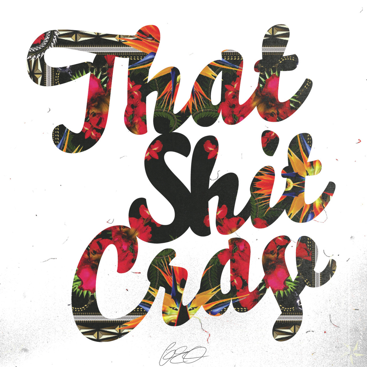
so many different text styles
_________________
|
|
| Back to top |
|
|
clash of clans hacks
Master Cheater
 Reputation: 63 Reputation: 63
Joined: 18 Jul 2007
Posts: 368
Location: Remember when we all used to put funny lines here?
|
| Posted: Sun Sep 30, 2012 11:25 am Post subject: |
|
|
| Reminds me of cigarettes.
|
|
| Back to top |
|
|
Antagonist
Cheater
Reputation: 29
Joined: 24 Nov 2009
Posts: 48
Location: California
|
| Posted: Sun Sep 30, 2012 1:05 pm Post subject: |
|
|
| Daniel. wrote: | | so many different text styles |
I suppose. Some fonts are similar to each other, I just didnt want it to be boring. I wish I was good enough to actually draw out my own letters. Still getting the hang of the pen tool.
| Adnihil wrote: | | Reminds me of cigarettes. |
Is that good or bad? 
_________________
| tough guy talix wrote: | | i've had it with your shit. fuck outta here |
|
|
| Back to top |
|
|
Kurifodo
I post too much
 Reputation: 23 Reputation: 23
Joined: 09 Oct 2008
Posts: 2782
|
|
| Back to top |
|
|
Antagonist
Cheater
Reputation: 29
Joined: 24 Nov 2009
Posts: 48
Location: California
|
| Posted: Mon Oct 01, 2012 4:50 pm Post subject: |
|
|
| Sam³ wrote: | My friend was with me when I was viewing this thread and I asked him his opinion and he said you should make it look like this or if not at least it can inspire you if your having trouble.
 |
Im doing something like that in my next project, but in my honest opinion, I don't know if I will succeed because ive been trying to figure out how to do something like that! Hopefully everything will go smoothly . Give your friend my best regards for me!
_________________
| tough guy talix wrote: | | i've had it with your shit. fuck outta here |
|
|
| Back to top |
|
|
bubblebobble
Newbie cheater
![]() Reputation: 0 Reputation: 0
Joined: 08 Oct 2012
Posts: 14
|
| Posted: Fri Oct 12, 2012 9:04 pm Post subject: |
|
|
Because the image is text-heavy, there could be better choices for the fonts. Text-only can be very limiting, so stylistic font choices become more crucial to getting the message across. Keys words of focus are "peace, mind, life, and fine." Every other word needs not to distract from the key words.
Possibly because the fonts give a formal structured style found on labels, the image is similar to cigarette and beer packaging. Unless the goal is to hint at stimulants/depressants as being the "peace in mind" (or rather "peace of mind")?
|
|
| Back to top |
|
|
MiguelKN2
Master Cheater
 Reputation: 0 Reputation: 0
Joined: 05 May 2009
Posts: 282
Location: Venezuela
|
| Posted: Mon Aug 05, 2013 1:24 pm Post subject: |
|
|
Reminds me of marlboro box art but i think it would look good on a shirt
_________________
But hey that's just my opinion |
|
| Back to top |
|
|
|


